
Red Flag
Advisor
AI Relationship Analysis Platform
- Discipline
- Brand · Product · AI Interface
- Year
- 2026
- Status
- Live at myredflag.app
Overview
A private companion that reads a conversation and returns the truth you already suspected.
Red Flag Advisor is an AI product built for people navigating modern dating — the mixed signals, the breadcrumbing, the slow fade. Users paste a conversation and receive a calm, structured reading: a risk score, the underlying patterns, and a keepsake receipt of what really happened.
It serves an audience who don't want another dating app — they want a second opinion. Something quiet, private, and honest, that helps them trust their own instincts again.
The challenge
Turn emotional confusion into insight that feels trustworthy.
People rarely struggle with dating because they lack information. They struggle because signals contradict each other — warmth followed by silence, plans without follow-through, affection without commitment. Existing tools either oversimplify ("green flag / red flag") or overwhelm with generic advice.
The product needed to hold a difficult emotional register — direct enough to be useful, gentle enough to be trusted with the private fragments of someone's life.
Product strategy
Simplicity over feature overload
One flow, one outcome. No dashboards, no gamification. The value lives in a single, considered reading.
Trust and clarity
Plain language, no jargon. Every claim traces back to something the user can see in their own conversation.
Explainable AI
The model doesn't just judge — it shows its work. Each verdict is grounded in named patterns and quoted evidence.
Mobile-first experience
Designed for the moment it's actually used — one hand, on a phone, late at night. Every surface obeys that.
Brand direction
Editorial, warm and quietly confident.
The identity avoids the two clichés of the category — clinical tech blues and playful dating-app pastels. Instead: warm neutral paper, deep black type, and a single restrained red used only where truth needs to land.
Editorial
Set like a small publication, not a SaaS product.
Warm neutral palette
Ivory, bone, ink. A calm room to think in.
A single red accent
Used sparingly. When it appears, it means something.
Emotionally accessible
Premium in craft, human in tone.
UX & interface
Five surfaces, one arc. The interface is structured like a short piece of writing — an input, a reading, a verdict, and a keepsake.
Conversation input
A soft, patient surface. Paste a screenshot or type in the messages — the product waits without prompting, and never asks for identifying detail.
Analysis
The model reads in the background. The interface shows the reading unfolding rather than a generic spinner — the wait itself becomes part of the trust.
Risk score
A single number out of one hundred. Contextualised, never absolute — always paired with the underlying patterns that produced it.
Key insight
One sentence, editorially set. The most important thing the reader needed to hear, distilled from the whole reading.
Relationship receipt
A shareable, keepsake document — set like a printed receipt. Something you can screenshot, revisit, or forward to the friend you would've called anyway.
Product showcase
Four screens from the shipped product, presented in sequence.
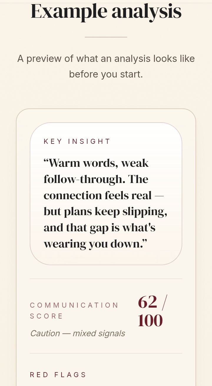
Conversation input
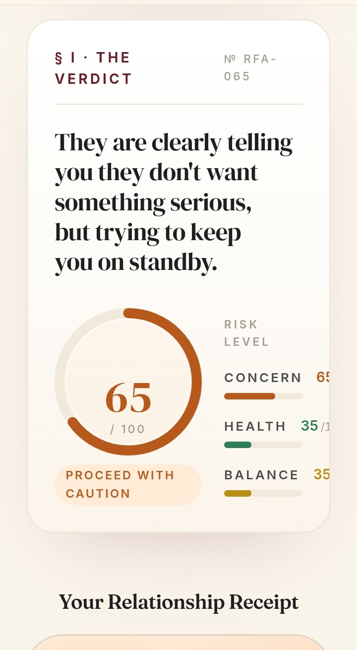
Analysis & verdict
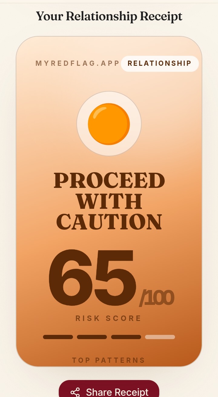
Relationship receipt
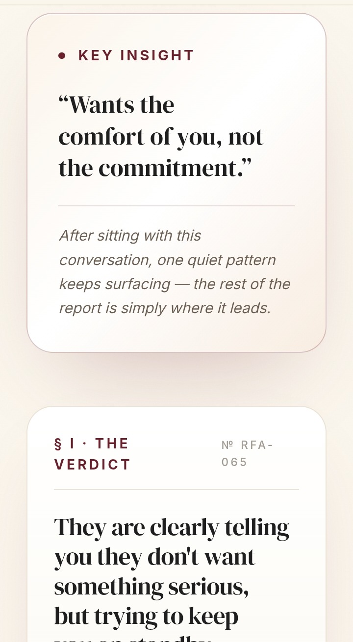
Key insight
Outcome
A clear, emotionally supportive AI product — with a brand and system designed to grow with it.
- —An AI product that feels considered, not clever.
- —A consistent brand and product experience — one voice across marks, marketing and interface.
- —A modular design system built to absorb new features without losing its editorial calm.